STYLE GUIDE
this is not a "one size fits all" guide. at the end of the day the most important thing is that you feel confident and comfortable. stay true to your style.
Color Scheme and Ideas on What to Wear
I know the pressure and stress that comes with dressing a family, or heck, even just yourself for photos. Hopefully these tips will help ease that burden and make it a much easier process by providing inspiration and hopefully a starting point.
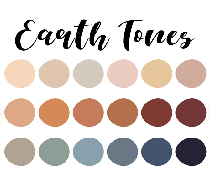
You Can Never Wear Enough Neutrals
Neutrals, also called Earth Tones, typically aren't found on the color wheel. They compliment almost everything. Wearing almost all neutrals and a small amount of other colors leaves little room for error. Remember, not too much of a bright color. A small amount is fine but the brighter it is, the less there should be. Neutrals are colors like off-white, cream, taupe, and grey. You can cover yourself head to toe in Earth Tones and photograph just lovely, but including some colors is fine too.


What Colors NOT to Wear (a lot of)
Black
Details get lost in darkness, and black tends to dull the image. Some black here & there is fine, but an entire item of clothing isn't recommended.
Dark Blue
Not including jeans, this color holds the same reasons as black. Remember, a small amount should be fine.
Neon
Problematic to edit, even small amounts on shoes.
Bright Red
Dark reds are beautiful, but bright red tends to cast a color onto skin. It is one of the toughest colors to work with.
Bright Blue
I tend to edit warm, so cool colors don't mix well. Bright blue also looks unnatural in nature, so keep in mind the location of your session.
Bright White
In small dosages please. It tends to look more blue in photos, and can even wash skin tones out. Off-white or cream is perfect.
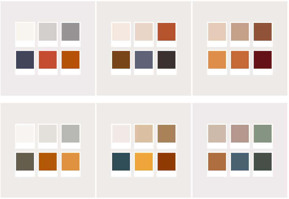
Example Color Combos
Remember, you can always add more of those neutral colors we talked about and depending on the size of your family, you may need to! But here are some good starting points.

Patterns and Your Photos
Patterns to Stay Away From
Dark against light patterns. Including tiny close together stripes and geometric designs. They can be distracting.
PLAID. If you are going to use it, only have one person wear it and be sure it's not a crazy color scheme, like blue+red or red+green.
Patterns You SHOULD Wear
Floral: smaller spaced out floral looks good, as well as larger floral prints.
Subtle shapes: be sure the pattern is not contrasting colors, like black & white. Try a light colored shirt with white shapes.


Applying this Guide
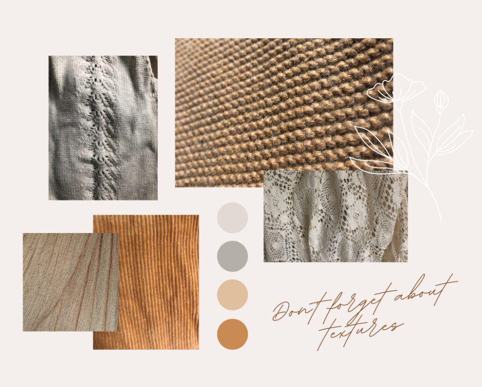
Okay so you've read through my tips, now what?! I understand it can be easier said than done. Try starting with one person. It's easier to visualize other outfits after you know what one will look like. Begin with mom, or daughter, since women's clothing tend to have more prints. Try to stick with one or MAYBE two patterns, with solids & textures for the rest. Or don't wear any patterns and stick to textures! Never underestimate the power of texture. They add so much interest in such a subtle way. My favorite textures are lace, knits, velvet, and even corduroy.
Compliment, Don't Match!
No more matching white shirts and blue jeans. We want colors that compliment each other: so for instance soft colors (light blue, grey, and blush) or warmer colors (brown, orange, and burgundy). If you want colorful images, choose a vivid color scheme.
Consider the Location
If your photos are in your living room that's decorated all white, you're not going to want to wear dark clothing. If you're in a colorful nursery, wear vivid outfits. If the session is outdoors, be sure the location compliments your clothing.
Shoes, Shoes, Shoes
Overlooked far too often, they can really make or break your outfit! If you really have no suitable shoes you love, consider going barefoot! It's a beautiful look in photos. But stay away from athletic shoes.